01CHARDONNAY PÉT-NAT

WILD RIVER
Still water calls. Fresh citrus, white peach and a mineral finish.

About
I’m Julia Wojtaszek - a designer focused on creating thoughtful digital experiences and visual identities. I work across UI, branding, and illustration, combining aesthetics with usability and clear communication.
Contact
About
I’m Julia Wojtaszek - a designer focused on creating thoughtful digital experiences and visual identities. I work across UI, branding, and illustration, combining aesthetics with usability and clear communication.
Contact
About
I’m Julia Wojtaszek - a designer focused on creating thoughtful digital experiences and visual identities. I work across UI, branding, and illustration, combining aesthetics with usability and clear communication.
Contact
About
I’m Julia Wojtaszek - a designer focused on creating thoughtful digital experiences and visual identities. I work across UI, branding, and illustration, combining aesthetics with usability and clear communication.
Contact

A pét-nat collection built around the boundary between what is visible above the surface and what remains hidden beneath it.
↓Undercurrent is a conceptual natural sparkling wine brand in which every bottle reveals a second narrative below the paper label. The surface stays restrained; the glass carries the hidden world.

The black illustration begins on textured paper at the waterline. Below it, white linework continues directly on transparent glass and becomes visible through the colour of the wine.
Still water calls. Fresh citrus, white peach and a mineral finish.

Light fades. Wild strawberry, red currant and a quiet mineral current.

Where the shore slips under the surface. Orange peel, stone fruit and saline depth.
Boats, piers, stairs, tables and doorways move between all three variants. Each landscape is distinct, but the repeated visual language keeps the collection connected.


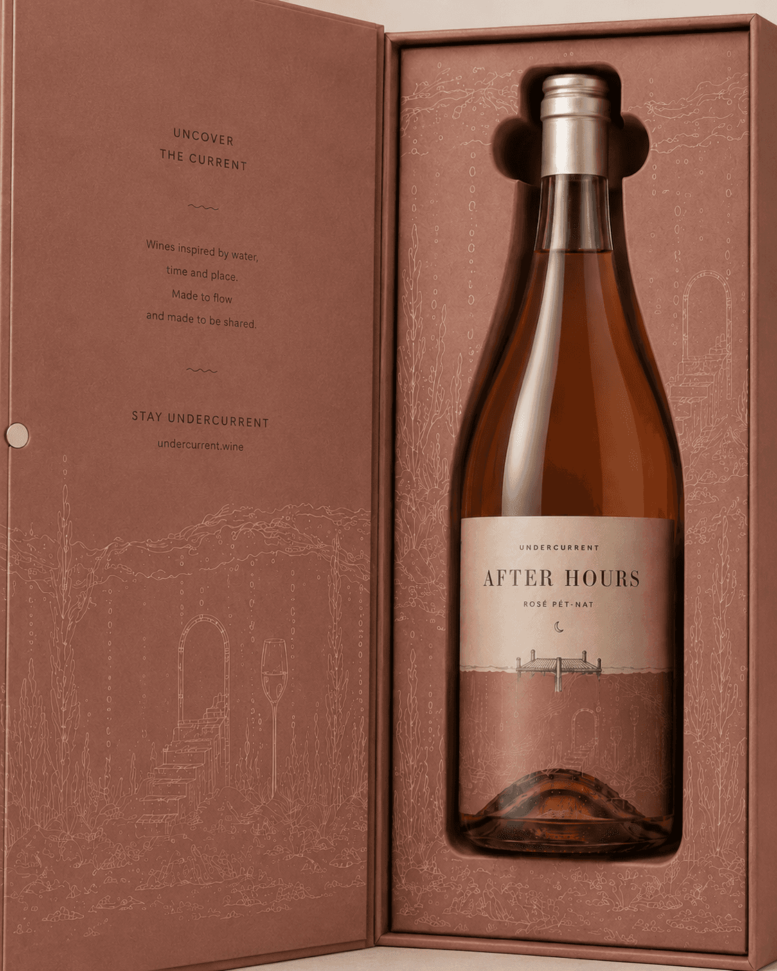
Rigid book boxes open to reveal a fitted insert and another part of the underwater landscape. The illustration does not stop when the bottle is placed inside.


A collective gift box brings the cream, rose and orange variants into one continuous landscape.

 Tissue paper
 Tasting cards
 Retail bags
The independent brand website translates the packaging idea into motion through rising waterlines, tonal transitions, illustration overlays and slow editorial pacing.


A pét-nat collection built around the boundary between what is visible above the surface and what remains hidden beneath it.
↓Undercurrent is a conceptual natural sparkling wine brand in which every bottle reveals a second narrative below the paper label. The surface stays restrained; the glass carries the hidden world.
The black illustration begins on textured paper at the waterline. Below it, white linework continues directly on transparent glass and becomes visible through the colour of the wine.
Still water calls. Fresh citrus, white peach and a mineral finish.
Light fades. Wild strawberry, red currant and a quiet mineral current.
Where the shore slips under the surface. Orange peel, stone fruit and saline depth.
Boats, piers, stairs, tables and doorways move between all three variants. Each landscape is distinct, but the repeated visual language keeps the collection connected.
Rigid book boxes open to reveal a fitted insert and another part of the underwater landscape. The illustration does not stop when the bottle is placed inside.
A collective gift box brings the cream, rose and orange variants into one continuous landscape.
Tissue paperTasting cardsRetail bagsThe independent brand website translates the packaging idea into motion through rising waterlines, tonal transitions, illustration overlays and slow editorial pacing.