01
Decide now
A supportive path for moments when the user feels hungry, stressed or unsure what to choose.
Home
→Help me decide
→Decision question
→Suggestion
→Save or retry

About
I’m Julia Wojtaszek - a designer focused on creating thoughtful digital experiences and visual identities. I work across UI, branding, and illustration, combining aesthetics with usability and clear communication.
Contact
About
I’m Julia Wojtaszek - a designer focused on creating thoughtful digital experiences and visual identities. I work across UI, branding, and illustration, combining aesthetics with usability and clear communication.
Contact
About
I’m Julia Wojtaszek - a designer focused on creating thoughtful digital experiences and visual identities. I work across UI, branding, and illustration, combining aesthetics with usability and clear communication.
Contact
About
I’m Julia Wojtaszek - a designer focused on creating thoughtful digital experiences and visual identities. I work across UI, branding, and illustration, combining aesthetics with usability and clear communication.
Contact

Project description
Project description
Nourish is a mobile app designed to support people who struggle with everyday food decisions. The experience reduces choice overload and offers calm, simple guidance based on the user’s current needs, mood and energy level.
Nourish is a mobile app designed to support people who struggle with everyday food decisions. The experience reduces choice overload and offers calm, simple guidance based on the user’s current needs, mood and energy level.
Role:
Role:
UX/UI Design, User Research, User Flow, Prototyping
UX/UI Design, User Research, User Flow, Prototyping
UX/UI Design, User Research, User Flow, Prototyping
Type
Type
Mobile App / UX/UI Case Study
Mobile App / UX/UI Case Study
Mobile App / UX/UI Case Study
Year:
Year:
2025
2025
2025
A calmer way to decide what to eat
A calmer way to decide what to eat
Nourish was created for moments when users feel hungry, tired or overwhelmed and do not know what to choose. Instead of showing endless recipes, the app provides a small number of supportive options and helps users move forward without pressure.
Nourish was created for moments when users feel hungry, tired or overwhelmed and do not know what to choose. Instead of showing endless recipes, the app provides a small number of supportive options and helps users move forward without pressure.

When users feel tired, stressed or emotionally overwhelmed, deciding what to eat can become another demanding task. Browsing long lists of recipes often increases frustration instead of helping.
Mental energy is already low. Even small decisions can feel difficult.
Too many options create confusion and make it harder to act.
Hunger, stress and low mood shape what users need in the moment.
Interviews showed that the difficulty was not a lack of food ideas. Users struggled most when they were tired, stressed or overwhelmed by too many possibilities.
Users wanted a small number of clear suggestions instead of browsing long lists of recipes.
Too many options made everyday food decisions feel more stressful and demanding.
Mood, energy level and stress strongly influenced what users wanted to eat.

When I’m tired, even deciding what to eat feels like another task.
Interviews showed that the difficulty was not a lack of food ideas. Users struggled most when they were tired, stressed or overwhelmed by too many possibilities.
Users wanted a small number of clear suggestions instead of browsing long lists of recipes.
Too many options made everyday food decisions feel more stressful and demanding.
Mood, energy level and stress strongly influenced what users wanted to eat.

When I’m tired, even deciding what to eat feels like another task.
The app was structured around three core needs: making an immediate food decision, planning meals in advance and browsing ideas for inspiration.
A supportive path for moments when the user feels hungry, stressed or unsure what to choose.
A structured flow for planning meals and creating a practical grocery list.
An exploratory path for users who want direction without making an immediate decision.
The detailed diagram maps the relationships between decision support, meal planning, inspiration and navigation.

The app was structured around three core needs: making an immediate food decision, planning meals in advance and browsing ideas for inspiration.
A supportive path for moments when the user feels hungry, stressed or unsure what to choose.
A structured flow for planning meals and creating a practical grocery list.
An exploratory path for users who want direction without making an immediate decision.
The detailed diagram maps the relationships between decision support, meal planning, inspiration and navigation.

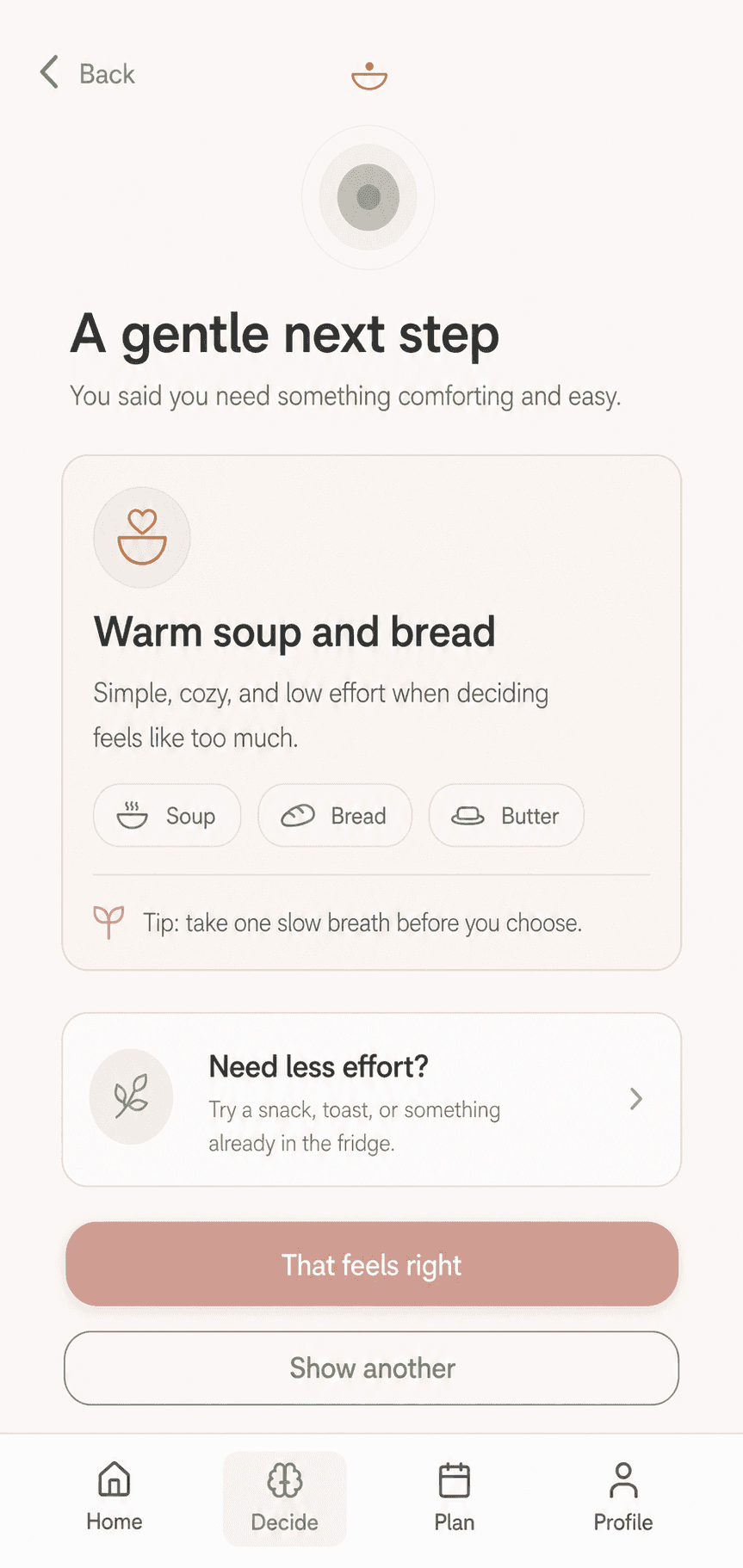
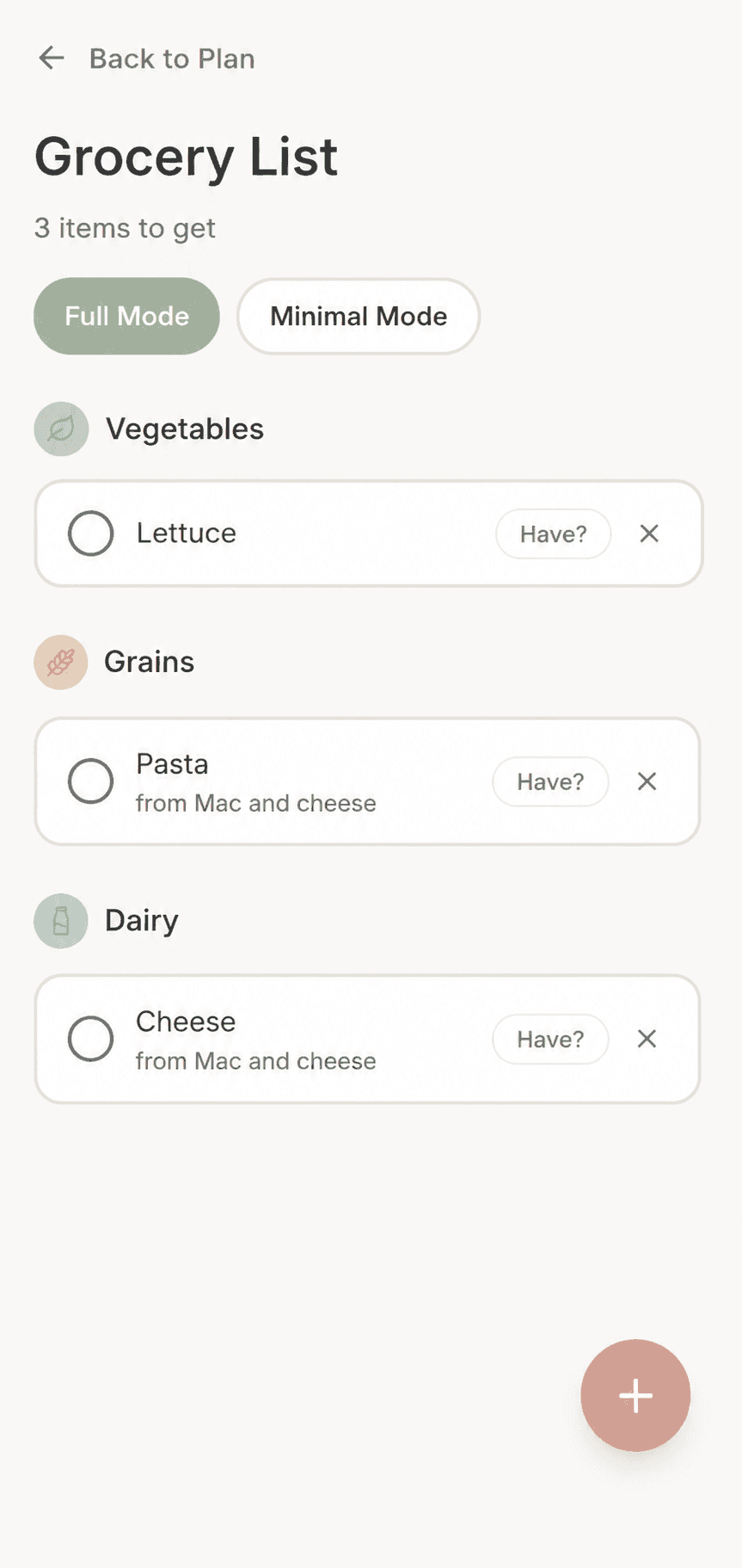
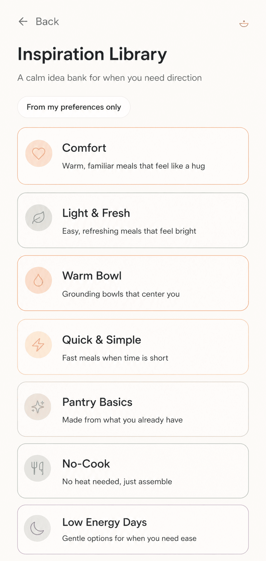
Nourish responds to different levels of energy and certainty. Users can ask for immediate support, plan ahead or browse a smaller, calmer set of ideas.
A guided path for moments when the user feels tired, hungry or overwhelmed and needs a clear next step.

A lightweight planning flow that turns selected meals into a practical and easy-to-follow grocery list.

A calm library organised around needs, mood and energy instead of endless recipe categories.
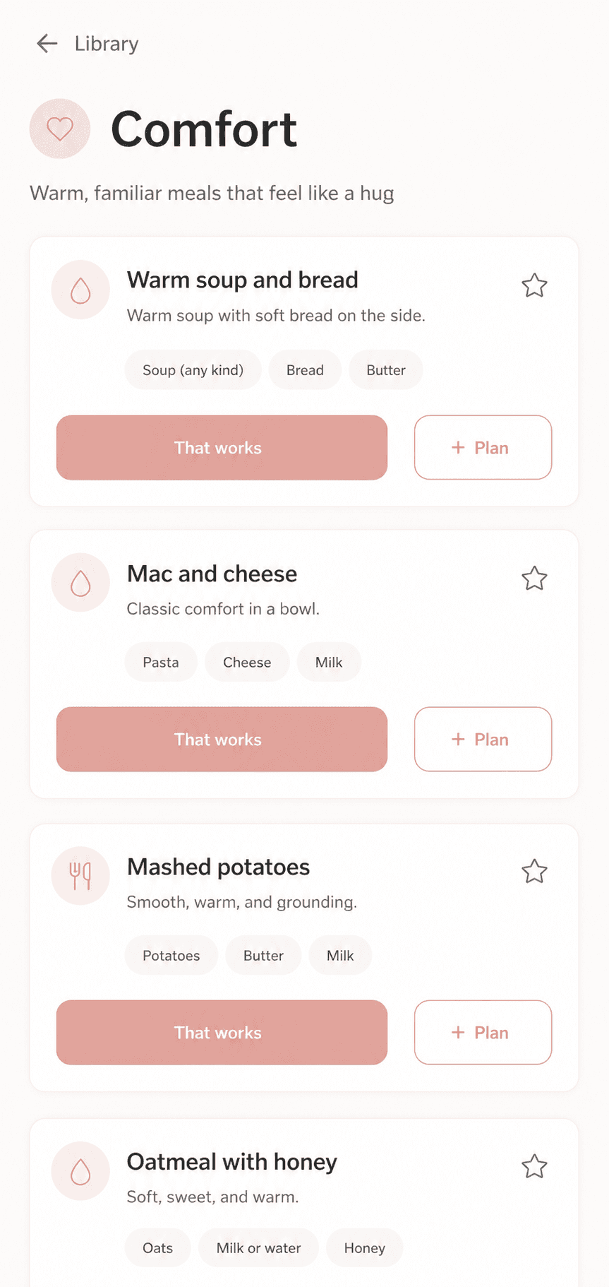
Soft contrast, restrained colour and generous spacing create an interface that feels supportive rather than demanding.
Warmth and support
Calm and balance
Primary surface
Neutral structure
Gentle contrast
Primary text
The component system uses subtle changes in colour, contrast and position to communicate state without adding visual noise.
The primary action confirms the user’s choice with a short state change instead of introducing another screen.
Click the button to preview the confirmation state.
Lower-priority actions remain visible without competing with the main decision.
Optional settings are explained in context, rather than presented as an isolated switch.
Colour and iconography help users distinguish categories without relying on heavy imagery.
Compact labels make ingredients and preferences easier to scan.
The active area is indicated with a soft background rather than a high-contrast highlight.
Two short flows show how Nourish supports the user from the first moment of uncertainty to a practical meal plan.
A short sequence of questions helps the user move from uncertainty to one clear meal suggestion.
The selected meal is added directly to the plan, creating an immediate and practical next step.
Two short flows show how Nourish supports the user from the first moment of uncertainty to a practical meal plan.
A short sequence of questions helps the user move from uncertainty to one clear meal suggestion.
The selected meal is added directly to the plan, creating an immediate and practical next step.
Nourish was designed around the idea that reducing choice can sometimes be more helpful than adding more options. The project focused on supporting users in moments of low energy, uncertainty and decision fatigue through a calm, structured and intentionally limited experience.
The goal was not to help users discover more food options. It was to help them feel confident choosing one.
Instead of building another extensive recipe platform, I focused on helping users make one manageable food decision at a time.
The project strengthened my ability to translate emotional and behavioural insights into focused product decisions, reusable UI components and clear interaction flows.
The next stage would include usability testing of the decision flow, validating the language used to describe mood and energy, and refining recommendations based on real user feedback.
Nourish was designed around the idea that reducing choice can sometimes be more helpful than adding more options. The project focused on supporting users in moments of low energy, uncertainty and decision fatigue through a calm, structured and intentionally limited experience.
The goal was not to help users discover more food options. It was to help them feel confident choosing one.
Instead of building another extensive recipe platform, I focused on helping users make one manageable food decision at a time.
The project strengthened my ability to translate emotional and behavioural insights into focused product decisions, reusable UI components and clear interaction flows.
The next stage would include usability testing of the decision flow, validating the language used to describe mood and energy, and refining recommendations based on real user feedback.