
About
I’m Julia Wojtaszek - a designer focused on creating thoughtful digital experiences and visual identities. I work across UI, branding, and illustration, combining aesthetics with usability and clear communication.
Contact
About
I’m Julia Wojtaszek - a designer focused on creating thoughtful digital experiences and visual identities. I work across UI, branding, and illustration, combining aesthetics with usability and clear communication.
Contact
About
I’m Julia Wojtaszek - a designer focused on creating thoughtful digital experiences and visual identities. I work across UI, branding, and illustration, combining aesthetics with usability and clear communication.
Contact
About
I’m Julia Wojtaszek - a designer focused on creating thoughtful digital experiences and visual identities. I work across UI, branding, and illustration, combining aesthetics with usability and clear communication.
Contact
Built for
uncertainty.
MORKA is an outdoor equipment identity built around endurance, observation and functional restraint.
The visual system balances the precision of technical gear with a quieter editorial character. Instead of communicating performance through visual noise, MORKA relies on clarity, material honesty and a strong relationship with the landscape.
Searching for
the right silhouette.
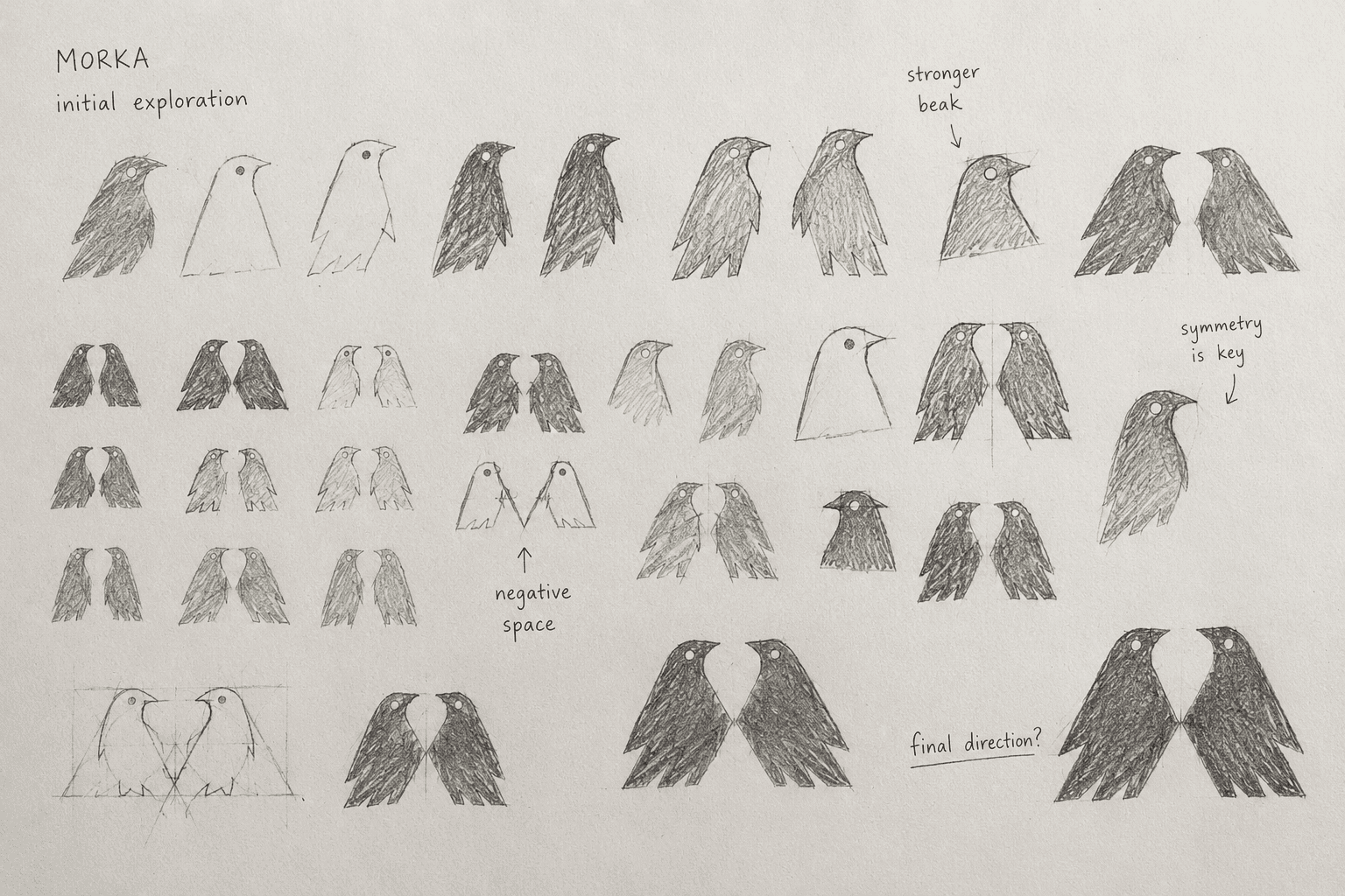
The first phase focused on reducing the bird form to a compact, recognisable shape. Different proportions, wings and head directions were tested before the system moved toward a mirrored pair.
 SKETCH 01
 SKETCH 02
 SKETCH 03
Two forms.
One system.
The final symbol is built from two mirrored birds. Their bodies meet through a narrow central negative space, creating a mark that can be read both as a pair and as one compact structure.


Testing the mark
by hand.
The symbol was also explored through linocut. Working manually exposed the silhouette to irregular edges, imperfect pressure and physical texture, helping test whether the form remained recognisable beyond a clean vector environment.
 LINOCUT / FULL PROCESS
 LINOCUT / DETAIL
From literal form
to visual shorthand.
The final identity emerged through a sequence of reduction. Each stage removed detail while preserving the character of the bird and improving reproduction at smaller scales.


Technical precision.
Editorial restraint.
Two typographic voices define the system. Canela introduces an editorial, expressive layer, while IBM Plex Mono brings the logic of technical specifications and field equipment.
Ii Jj Kk Ll Mm Nn Oo Pp
Qq Rr Ss Tt Uu Vv Ww Xx
Yy Zz
1234567890
Ii Jj Kk Ll Mm Nn Oo Pp
Qq Rr Ss Tt Uu Vv Ww Xx
Yy Zz
1234567890
One identity.
Different surfaces.
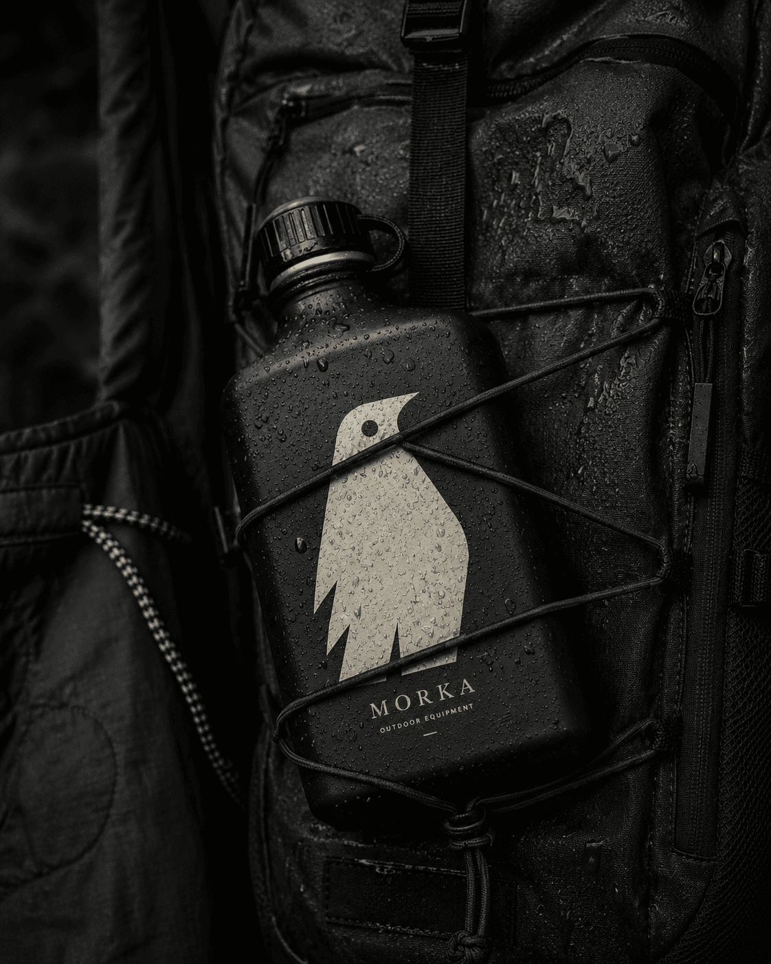
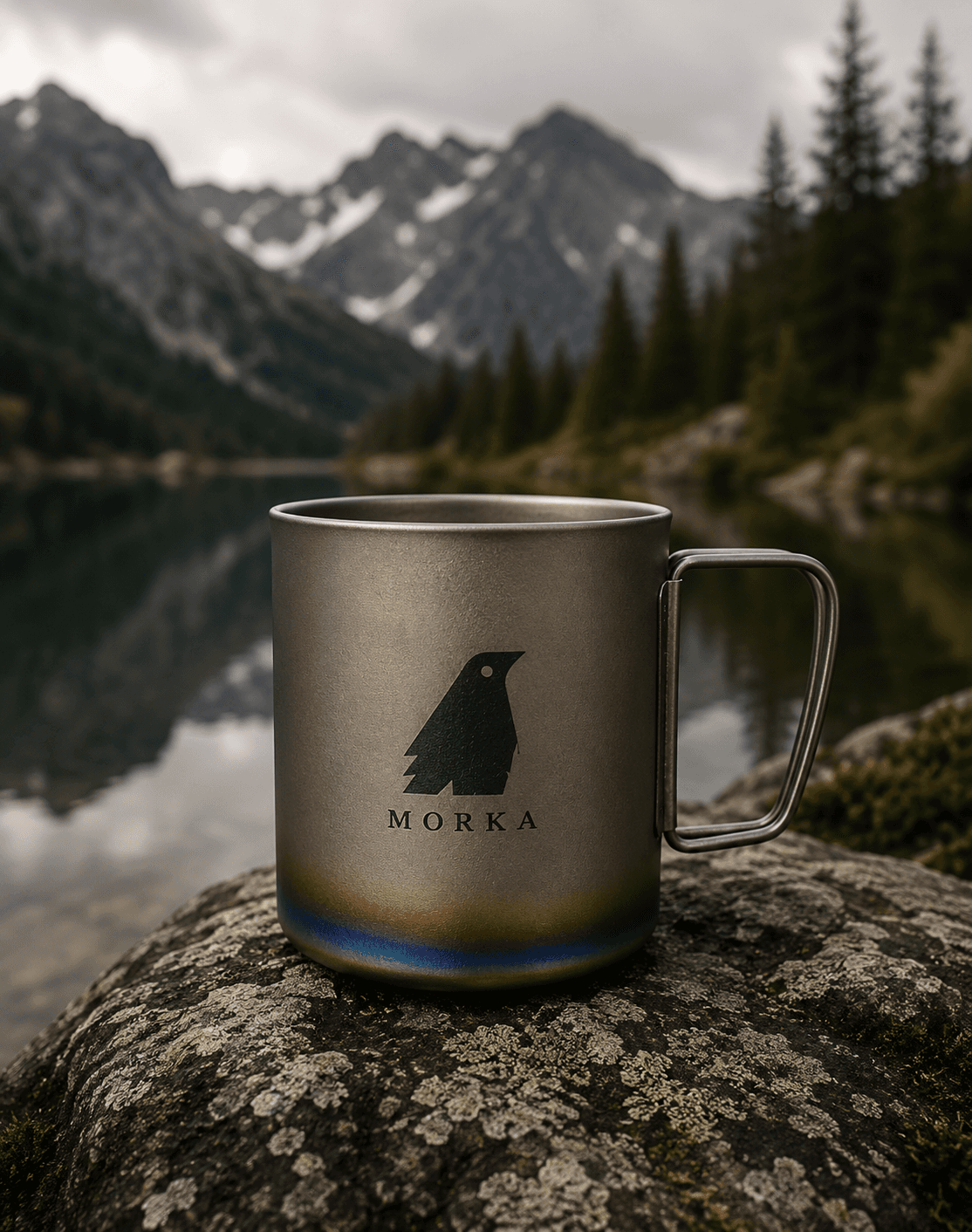
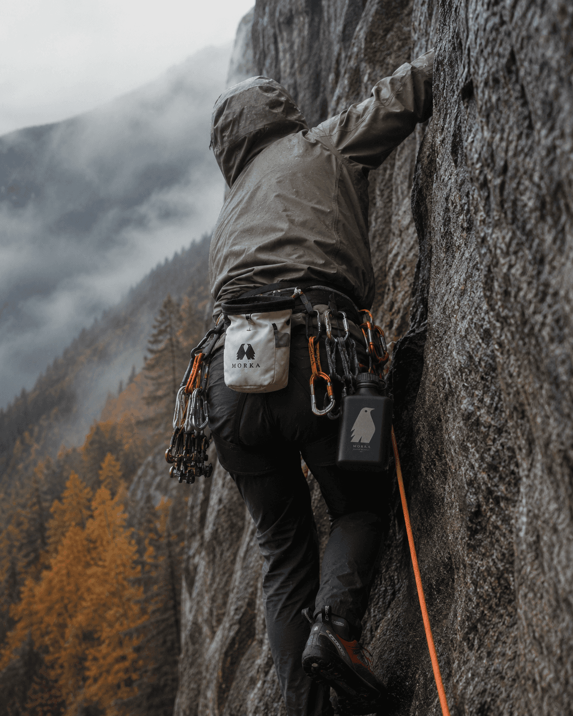
The system was designed to remain recognisable across fabric, metal, printed matter and technical accessories without relying on a single application style.
 APPLICATION 01
 APPLICATION 02
 APPLICATION 03
Built like
the product.
Product engineering became part of the identity. Ripstop grids, waterproof membranes, seam structures and specification tables influence both photography and interface design.
 MATERIAL / MACRO
 DETAIL / CONSTRUCTION
Built for
uncertainty.
MORKA is an outdoor equipment identity built around endurance, observation and functional restraint.
The visual system balances the precision of technical gear with a quieter editorial character. Instead of communicating performance through visual noise, MORKA relies on clarity, material honesty and a strong relationship with the landscape.
Searching for
the right silhouette.
The first phase focused on reducing the bird form to a compact, recognisable shape. Different proportions, wings and head directions were tested before the system moved toward a mirrored pair.
SKETCH 01SKETCH 02SKETCH 03Two forms.
One system.
The final symbol is built from two mirrored birds. Their bodies meet through a narrow central negative space, creating a mark that can be read both as a pair and as one compact structure.
Testing the mark
by hand.
The symbol was also explored through linocut. Working manually exposed the silhouette to irregular edges, imperfect pressure and physical texture, helping test whether the form remained recognisable beyond a clean vector environment.
LINOCUT / FULL PROCESSLINOCUT / DETAILFrom literal form
to visual shorthand.
The final identity emerged through a sequence of reduction. Each stage removed detail while preserving the character of the bird and improving reproduction at smaller scales.
Technical precision.
Editorial restraint.
Two typographic voices define the system. Canela introduces an editorial, expressive layer, while IBM Plex Mono brings the logic of technical specifications and field equipment.
Ii Jj Kk Ll Mm Nn Oo Pp
Qq Rr Ss Tt Uu Vv Ww Xx
Yy Zz
1234567890
Ii Jj Kk Ll Mm Nn Oo Pp
Qq Rr Ss Tt Uu Vv Ww Xx
Yy Zz
1234567890
One identity.
Different surfaces.
The system was designed to remain recognisable across fabric, metal, printed matter and technical accessories without relying on a single application style.
APPLICATION 01APPLICATION 02APPLICATION 03Built like
the product.
Product engineering became part of the identity. Ripstop grids, waterproof membranes, seam structures and specification tables influence both photography and interface design.
MATERIAL / MACRODETAIL / CONSTRUCTIONBuilt to feel
as purposeful as the gear.
The MORKA website translates the visual identity into a calm and functional digital experience. Editorial layouts, restrained typography and atmospheric imagery balance technical performance with the emotional character of the outdoors.
