
About
I’m Julia Wojtaszek - a designer focused on creating thoughtful digital experiences and visual identities. I work across UI, branding, and illustration, combining aesthetics with usability and clear communication.
Contact
About
I’m Julia Wojtaszek - a designer focused on creating thoughtful digital experiences and visual identities. I work across UI, branding, and illustration, combining aesthetics with usability and clear communication.
Contact
About
I’m Julia Wojtaszek - a designer focused on creating thoughtful digital experiences and visual identities. I work across UI, branding, and illustration, combining aesthetics with usability and clear communication.
Contact
About
I’m Julia Wojtaszek - a designer focused on creating thoughtful digital experiences and visual identities. I work across UI, branding, and illustration, combining aesthetics with usability and clear communication.
Contact

Maison & Savor
Occasional catering,
made intimate.
Maison & Savor is an occasional catering identity built around intimate dining, seasonal food and understated presentation.
The visual system combines tactile materials, elegant typography and a restrained burgundy palette to create a brand that feels refined without becoming formal or distant.
Designed around the moments
people gather for.
Private dinners, celebrations and carefully prepared gatherings became the starting point for a visual language focused on warmth, rhythm and quiet detail.
Building the mark.
The symbol was developed as a balanced composition of organic forms — a vessel, a delicate gesture and a small spark representing the finishing touch.
 Construction / proportions
Gesture
Soft organic forms introduce warmth and avoid the rigidity of traditional hospitality marks.
Spark
A small central detail represents the finishing touch and sense of occasion.
Vessel
The lower shapes reference serving, food and the ritual of sharing a meal.
Warm, restrained, tactile.
Playfair Display
ABCDEFGHIJKLMNOPQRSTUVWXYZ
abcdefghijklmnopqrstuvwxyz
0123456789
Montserrat
ABCDEFGHIJKLMNOPQRSTUVWXYZ
abcdefghijklmnopqrstuvwxyz
0123456789
From layout to table.


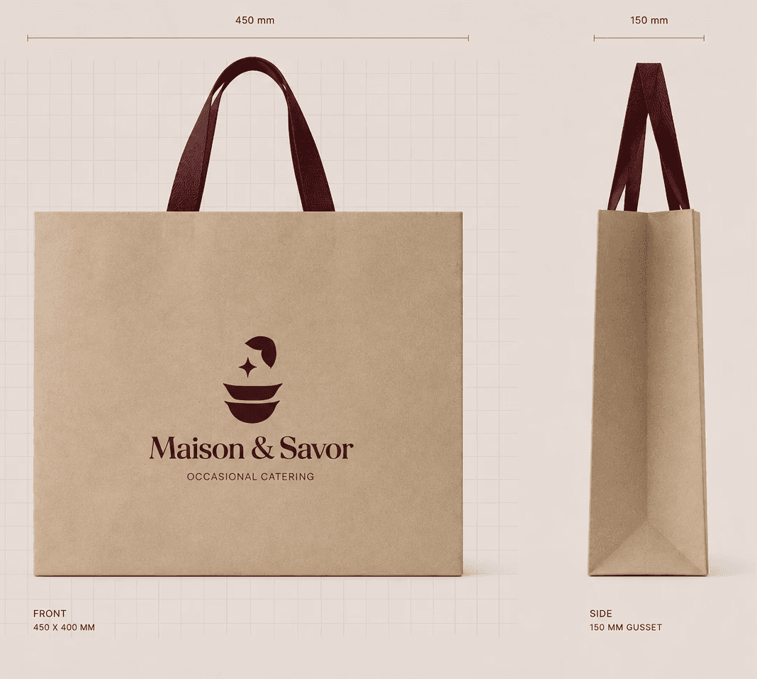
A quieter kind of packaging.
Natural paper, restrained branding and burgundy textile details extend the identity beyond the dining table.


Paper.
Texture.
Restraint.
The dinner continues.


Designed to belong in the moment.
An invitation to discover more.
A tactile sliding card introduces catering options through a simple physical interaction, adding a subtle moment of discovery to the printed system.


Made for moments
worth gathering for.
More projects


Maison & Savor
Occasional catering,
made intimate.
Maison & Savor is an occasional catering identity built around intimate dining, seasonal food and understated presentation.
The visual system combines tactile materials, elegant typography and a restrained burgundy palette to create a brand that feels refined without becoming formal or distant.
Designed around the moments
people gather for.
Private dinners, celebrations and carefully prepared gatherings became the starting point for a visual language focused on warmth, rhythm and quiet detail.
Building the mark.
The symbol was developed as a balanced composition of organic forms — a vessel, a delicate gesture and a small spark representing the finishing touch.
 Construction / proportions
Gesture
Soft organic forms introduce warmth and avoid the rigidity of traditional hospitality marks.
Spark
A small central detail represents the finishing touch and sense of occasion.
Vessel
The lower shapes reference serving, food and the ritual of sharing a meal.
Warm, restrained, tactile.
Playfair Display
ABCDEFGHIJKLMNOPQRSTUVWXYZ
abcdefghijklmnopqrstuvwxyz
0123456789
Montserrat
ABCDEFGHIJKLMNOPQRSTUVWXYZ
abcdefghijklmnopqrstuvwxyz
0123456789
From layout to table.
A quieter kind of packaging.
Natural paper, restrained branding and burgundy textile details extend the identity beyond the dining table.
Paper.
Texture.
Restraint.
The dinner continues.

Designed to belong in the moment.
An invitation to discover more.
A tactile sliding card introduces catering options through a simple physical interaction, adding a subtle moment of discovery to the printed system.