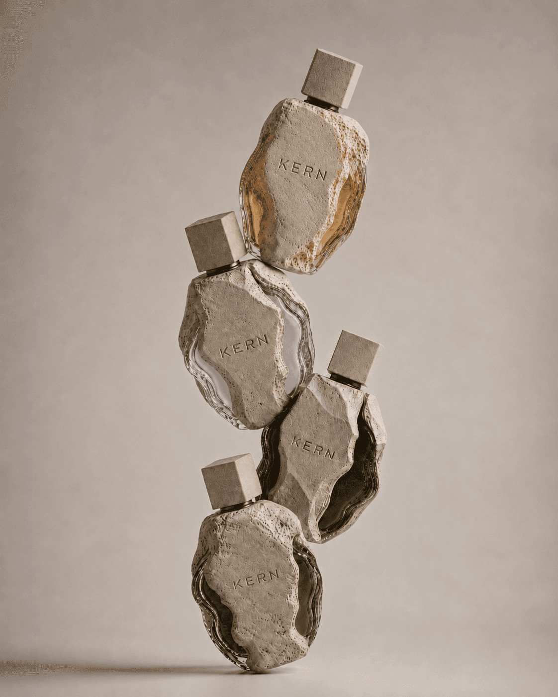
Bottle directions
Concept fragrance brand
KERN is a conceptual niche perfume brand built around mineral texture, coloured glass cores and the ritual of revealing an object.

Scope
Brand concept, logo, visual identity, packaging, product imagery and e-commerce experience.
Challenge
To move perfume away from beauty clichés and create a visual language closer to sculpture and material archives.
Outcome
A complete system for four fragrance objects: Amber, Iris, Moss and Smoke.
01 / Concept
The starting point was to treat fragrance as a physical artefact. The bottle is partially covered by a porous mineral shell, while the glass core reveals the scent colour.
This idea shaped the whole system: restrained typography, low-saturation mineral colour, tactile imagery and packaging that opens like a case.
Containment
The scent is visually held inside a heavier mineral body.
Reveal
Opening, uncovering and exposing the core became the main design logic.
Contrast
Rough stone is paired with smooth glass and precise typography.
Archive
The communication feels closer to cataloguing objects than selling cosmetics.
02 / Visual direction


Graphic approach
The visual system is based on controlled tension: irregular organic form vs. precise editorial structure. Large negative space, thin labels and soft panels keep the brand premium.
03 / Logo

Final mark
The logo uses thin letterforms and wide spacing. It feels quiet, linear and slightly engraved, so it works against the rough irregular bottle.
Outlined wordmark
Wide tracking
Mineral / archival / restrained
On stone, grey, black and warm neutral surfaces
04 / Sketches & exploration
Bottle directions

Logo exploration

Logo placement

Packaging mechanism
Form decisions
The silhouette avoids perfect symmetry. The shell behaves like a cast surface: uneven, protective and mineral. The square cap creates a geometric counterpoint.
System logic
Each scent keeps the same structural language — shell, core, cap and mark — but changes colour and atmosphere.
05 / Typography & colour
Primary type
Thin geometric sans, uppercase labels, wide tracking and quiet editorial rhythm.
Editorial accent
Italic serif appears only as a soft contrast to the technical sans typography.
Layout rules
Stone
#F5EFE6Mineral
#DED3C3Ink
#12100DAmber
#C7832FIris
#C1B1ECMoss
#556947Smoke
#2A1C1506 / Material language

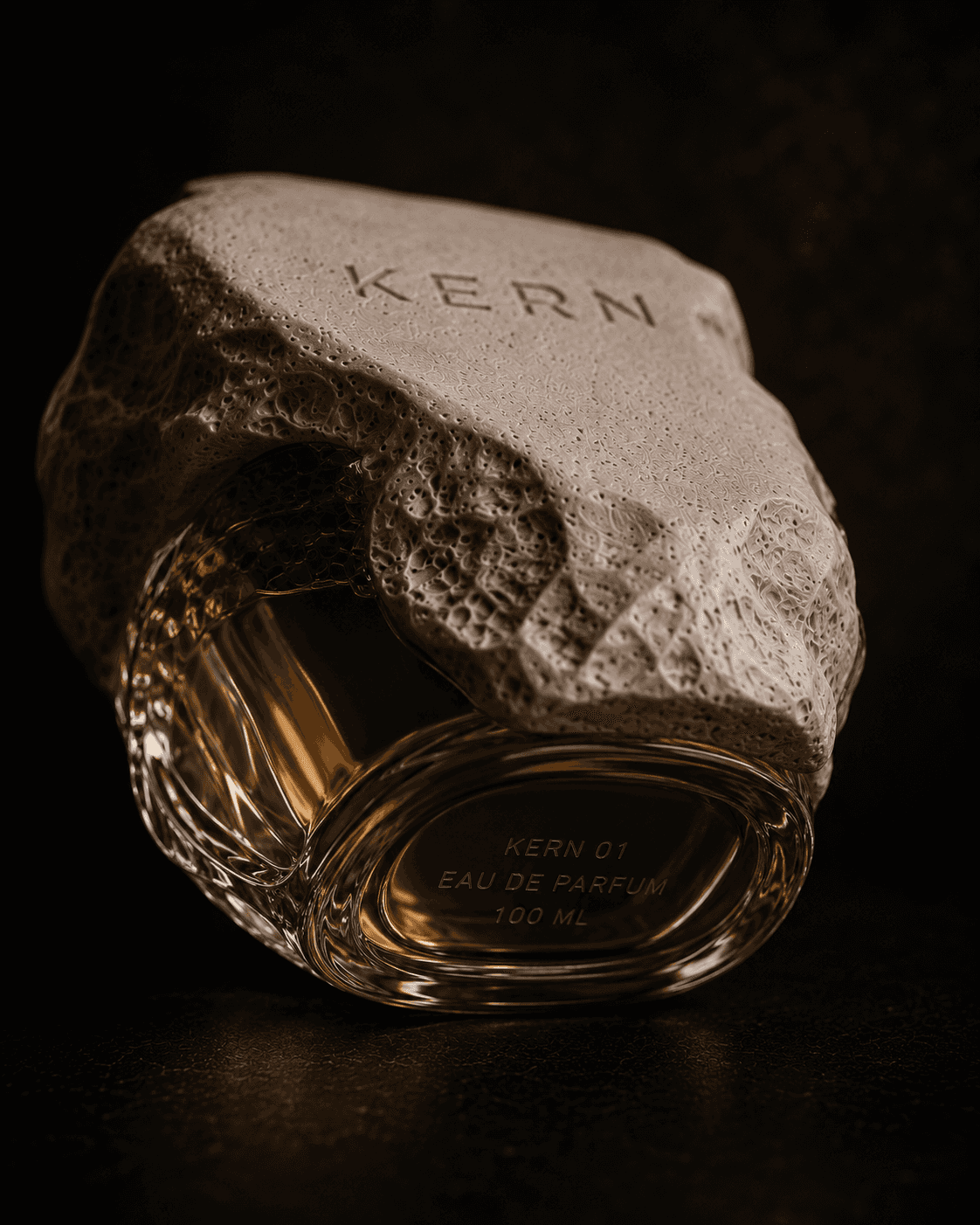

Porous shell
Matte, rough and heavy. It gives the object a sculptural body.
Glass core
Transparent colour becomes the code for each scent.
Soft light
Warm, diffused light makes the stone tactile.
Grain
Subtle noise gives the system an analogue finish.
07 / Collection

01 / Saffron / Labdanum / Warm Musk

02 / Pale Iris / Concrete Powder / Cool Skin

03 / Wet Stone / Green Silence

04 / Charcoal / Dry Wood / Mineral Smoke

Amber

Iris

Moss
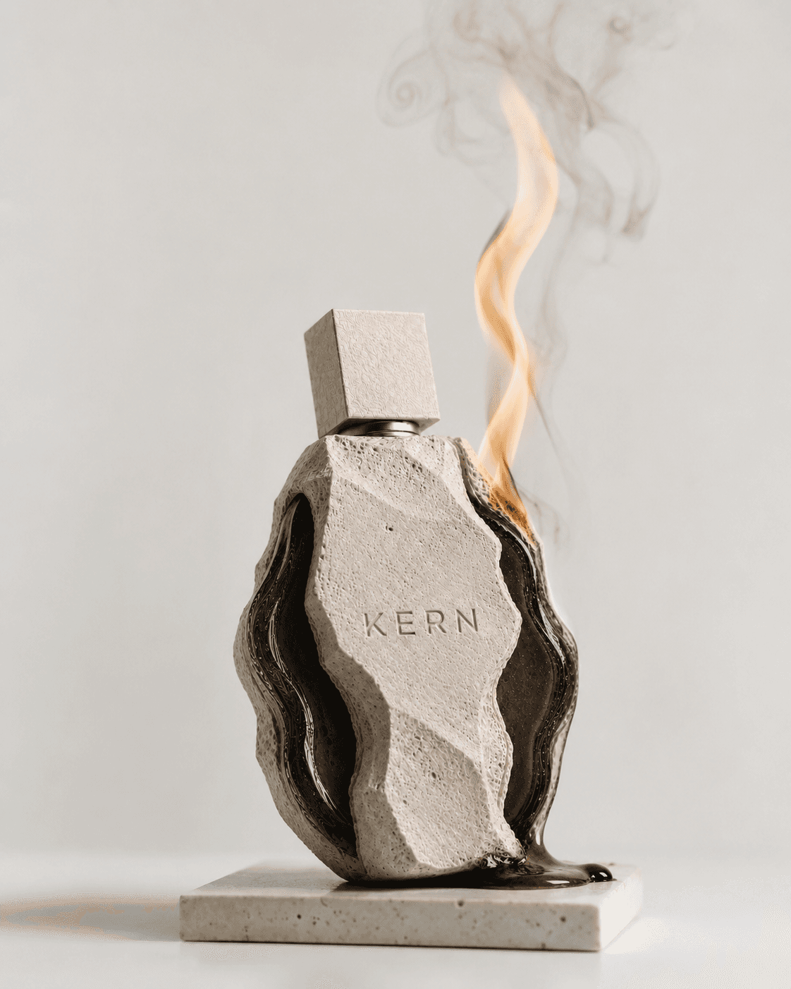
Smoke
08 / Packaging


Packaging logic
The case separates along a central fracture line. The object is not simply unboxed — it is revealed like a specimen inside a cavity.
Technical thinking
The system uses a central axis, low-contrast embossing, mineral texture and a visible relationship between case and bottle.
09 / Web experience


Interaction system
The e-commerce page keeps commercial clarity: product cards, prices, scent descriptions and add-to-bag actions.
Digital art direction
Motion, hover states, packaging reveal, stone backgrounds and asymmetric layouts make the store feel like a material archive.
10 / Final system