
About
I’m Julia Wojtaszek - a designer focused on creating thoughtful digital experiences and visual identities. I work across UI, branding, and illustration, combining aesthetics with usability and clear communication.
Contact
About
I’m Julia Wojtaszek - a designer focused on creating thoughtful digital experiences and visual identities. I work across UI, branding, and illustration, combining aesthetics with usability and clear communication.
Contact
About
I’m Julia Wojtaszek - a designer focused on creating thoughtful digital experiences and visual identities. I work across UI, branding, and illustration, combining aesthetics with usability and clear communication.
Contact
About
I’m Julia Wojtaszek - a designer focused on creating thoughtful digital experiences and visual identities. I work across UI, branding, and illustration, combining aesthetics with usability and clear communication.
Contact
Brand Identity / Packaging / Art Direction
BUN BUN
BUN BUN is a concept bakery brand built around everyday bread, coffee and casual city rituals. The identity combines a soft geometric symbol, editorial typography, raw paper textures and a bold cobalt accent.

Project overview
The goal was to create a bakery identity that feels distinctive but still accessible. Instead of a clean premium bakery aesthetic, BUN BUN uses a slightly raw, editorial and collage-based visual language.
Concept project
Visual identity, packaging, social media, print
2026
Brand idea
Everyday bakery with a graphic attitude
BUN BUN was created as a casual city bakery brand — warm, accessible and visually expressive. The goal was to move away from overly polished premium bakery aesthetics and build an identity that feels local, everyday and slightly playful, while still remaining structured and recognisable.
Everyday
Warm
Local
Editorial
Playful
Raw
Cobalt
Bread-first
Logo concept
A monogram inspired by bread scoring
The BUN BUN symbol is based on a symmetrical monogram inspired by the letter “B”, the rounded shape of a loaf and the scoring mark on bread.
Two bold black forms create a stable structure, while the negative space in the centre forms an organic cut-like shape. The cobalt detail works as a distinctive brand accent.

Logo construction
Soft geometry, mirrored forms and a scoring detail
The mark is constructed from mirrored black shapes, a central cut and a cobalt scoring line. The construction keeps the symbol simple enough for packaging, while giving it a more distinctive, ownable form.
Mirrored forms
Two symmetrical shapes create a stable monogram structure.
Bread scoring
The central negative space references the cut on a loaf of bread.
Cobalt accent
The blue detail connects the logo with the wider brand system.


Visual system
Colour palette & typography
Black
HEX: #111111
Cobalt
HEX: #0047FF
Cream
HEX: #F2EDE6
Canela
Used for the logo, headlines and expressive editorial moments.
Neue Montreal
Used for descriptions, captions, menu information and functional communication.

Graphic language
Raw paper, cobalt cuts and bakery collage
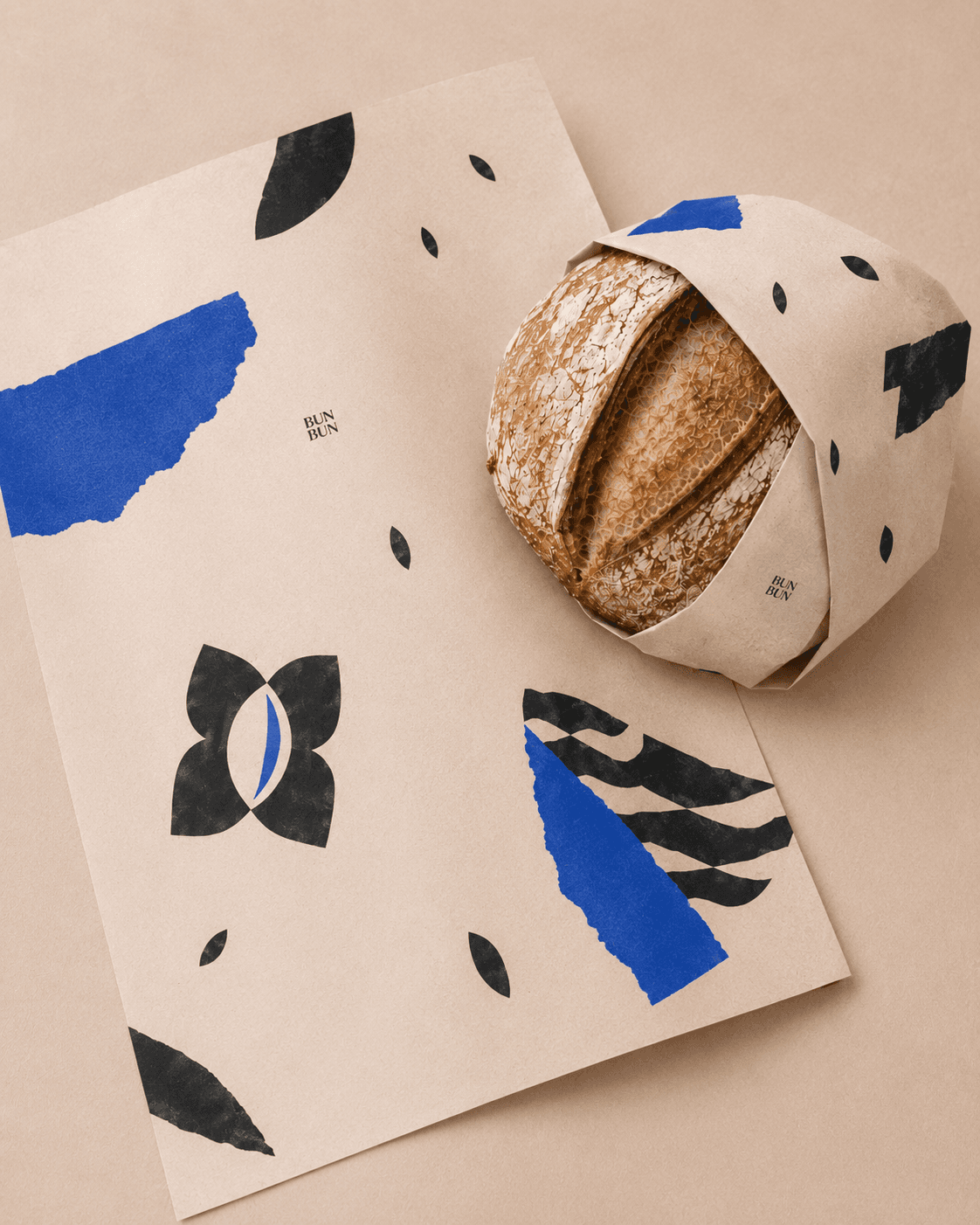
The visual language combines raw paper textures, cobalt torn-paper shapes and black-and-white cut-out bakery imagery. This creates a flexible system that can be used across posters, packaging, social media and in-store materials.
Print design
Daily menu
The folded menu works as a small editorial object — part price list, part daily bakery note.


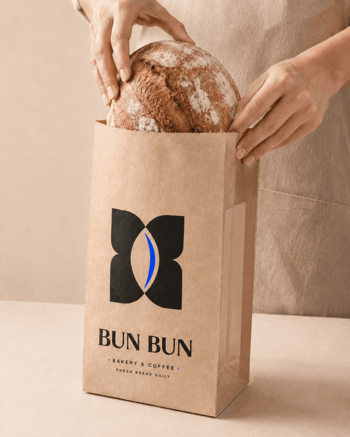
Packaging system
Simple everyday materials with expressive brand moments
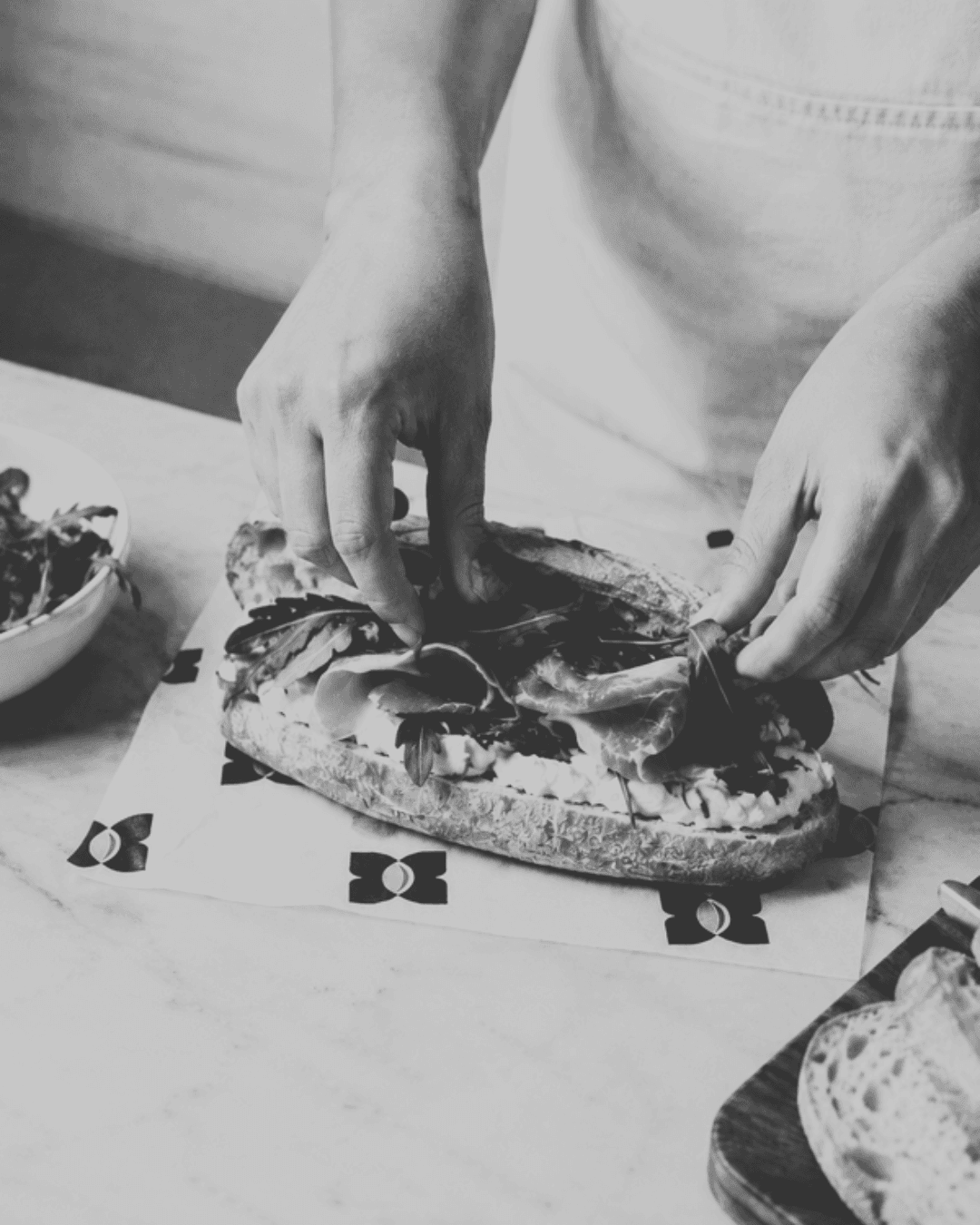
Kraft paper bags keep the brand grounded and accessible, while cobalt collage elements create stronger recognition on cups, wraps and promotional materials.


Brand in use
Everyday bakery moments
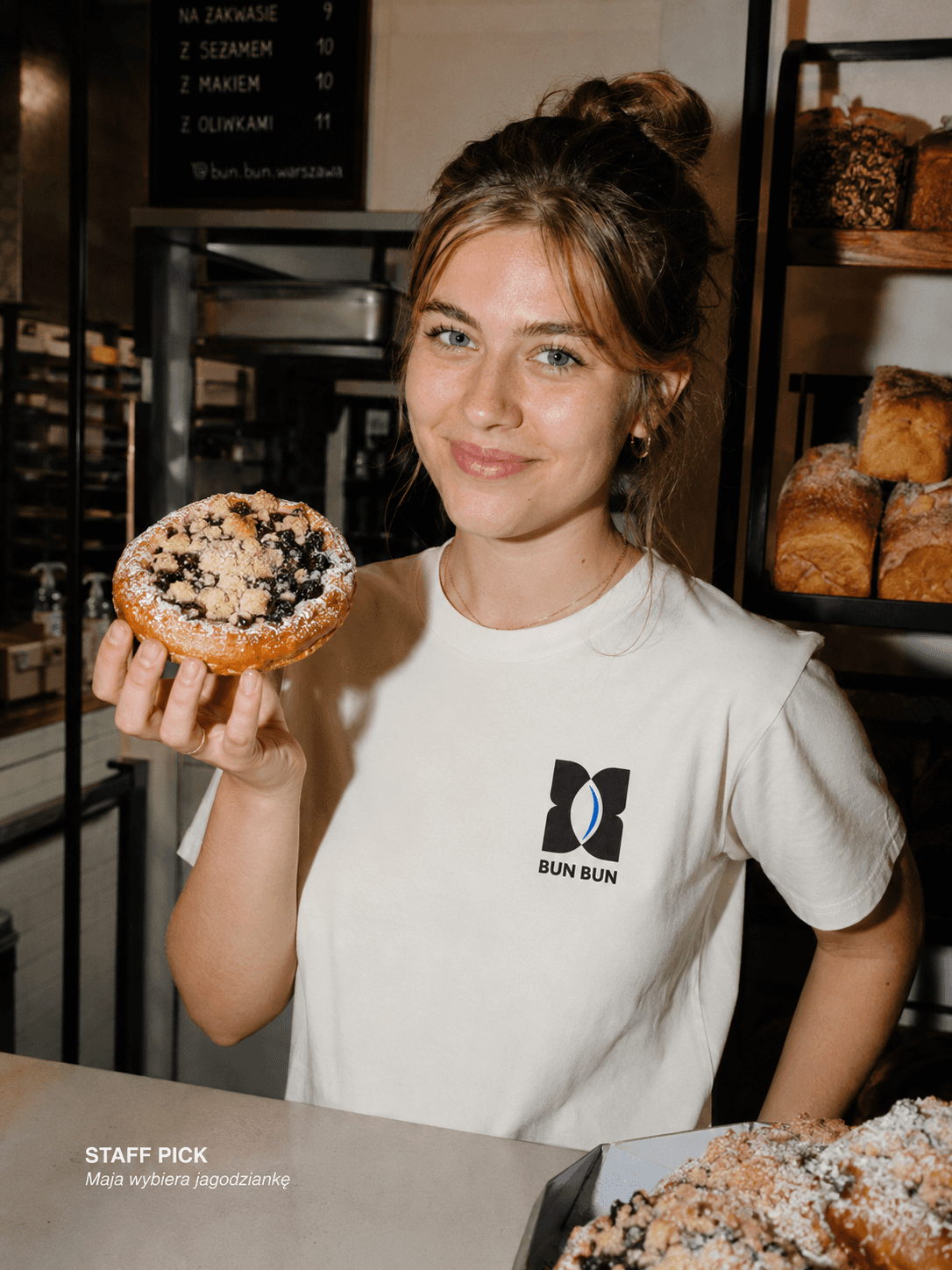
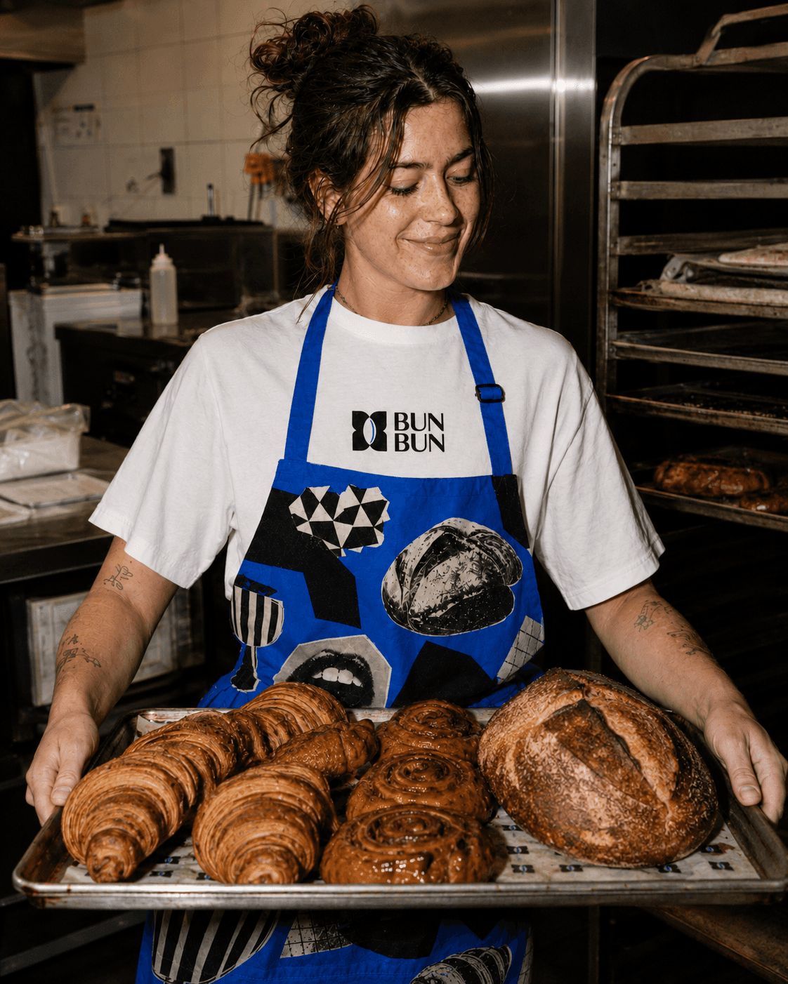
The art direction is based on casual, believable moments — staff portraits, product details, street-level scenes and warm bakery interiors.


Cobalt accent
Used to make the bakery visually recognisable without making the whole identity overly colourful.
Raw paper textures
Used to keep the identity grounded, tactile and connected to everyday bakery packaging.
Collage graphics
Used to add personality and make the brand more memorable across social media and print.
Social media
Instagram feed direction
The feed combines everyday food photography, staff moments, product close-ups and occasional typographic posts.




Final outcome
The final identity creates a recognisable bakery brand that feels casual, local and visually memorable. By combining a simple monogram, raw paper materials, expressive cobalt accents and collage-based graphics, BUN BUN can work across everyday packaging, social media, print and in-store communication.
Brand Identity / Packaging / Art Direction
BUN BUN
BUN BUN is a concept bakery brand built around everyday bread, coffee and casual city rituals. The identity combines a soft geometric symbol, editorial typography, raw paper textures and a bold cobalt accent.
Project overview
The goal was to create a bakery identity that feels distinctive but still accessible. Instead of a clean premium bakery aesthetic, BUN BUN uses a slightly raw, editorial and collage-based visual language.
Concept project
Visual identity, packaging, social media, print
2026
Brand idea
Everyday bakery with a graphic attitude
BUN BUN was created as a casual city bakery brand — warm, accessible and visually expressive. The goal was to move away from overly polished premium bakery aesthetics and build an identity that feels local, everyday and slightly playful, while still remaining structured and recognisable.
Everyday
Warm
Local
Editorial
Playful
Raw
Cobalt
Bread-first
Logo concept
A monogram inspired by bread scoring
The BUN BUN symbol is based on a symmetrical monogram inspired by the letter “B”, the rounded shape of a loaf and the scoring mark on bread.
Two bold black forms create a stable structure, while the negative space in the centre forms an organic cut-like shape. The cobalt detail works as a distinctive brand accent.
Logo construction
Soft geometry, mirrored forms and a scoring detail
The mark is constructed from mirrored black shapes, a central cut and a cobalt scoring line. The construction keeps the symbol simple enough for packaging, while giving it a more distinctive, ownable form.
Mirrored forms
Two symmetrical shapes create a stable monogram structure.
Bread scoring
The central negative space references the cut on a loaf of bread.
Cobalt accent
The blue detail connects the logo with the wider brand system.
Visual system
Colour palette & typography
Black
HEX: #111111
Cobalt
HEX: #0047FF
Cream
HEX: #F2EDE6
Canela
Used for the logo, headlines and expressive editorial moments.
Neue Montreal
Used for descriptions, captions, menu information and functional communication.
Graphic language
Raw paper, cobalt cuts and bakery collage
The visual language combines raw paper textures, cobalt torn-paper shapes and black-and-white cut-out bakery imagery. This creates a flexible system that can be used across posters, packaging, social media and in-store materials.
Print design
Daily menu
The folded menu works as a small editorial object — part price list, part daily bakery note.
Packaging system
Simple everyday materials with expressive brand moments
Kraft paper bags keep the brand grounded and accessible, while cobalt collage elements create stronger recognition on cups, wraps and promotional materials.
Brand in use
Everyday bakery moments
The art direction is based on casual, believable moments — staff portraits, product details, street-level scenes and warm bakery interiors.

Cobalt accent
Used to make the bakery visually recognisable without making the whole identity overly colourful.
Raw paper textures
Used to keep the identity grounded, tactile and connected to everyday bakery packaging.
Collage graphics
Used to add personality and make the brand more memorable across social media and print.
Social media
Instagram feed direction
The feed combines everyday food photography, staff moments, product close-ups and occasional typographic posts.
Final outcome
The final identity creates a recognisable bakery brand that feels casual, local and visually memorable. By combining a simple monogram, raw paper materials, expressive cobalt accents and collage-based graphics, BUN BUN can work across everyday packaging, social media, print and in-store communication.