
See what happens before you spend.
Ahead turns financial uncertainty into a clear visual forecast, so a purchase can be tested before it reaches the account.
Meet Maya. She wants clarity before she commits.
Maya is 28, works in marketing and manages her money responsibly, but upcoming bills, subscriptions and planned purchases are difficult to combine into one reliable picture.
Maya Young
“I don’t need another spending chart. I need to know what happens if I buy something today.”
Plan without second-guessing
Understand whether a purchase is safe now, after payday or better moved to another date.
The balance lacks context
Her account balance does not explain what future bills, shared costs and goals will do to it.
She checks before she commits
Maya already compares dates, pending costs and payday manually before making bigger purchases.
One answer, with reasoning
A clear safe-to-spend amount plus enough context to understand why it changes.
A banking app that answers one human question: “Can I actually afford this?”
Balances show now, not what comes next.
Upcoming bills, goals and shared costs stay mentally disconnected.
From expense tracking to decision support.
Ahead lets users test a purchase amount, date and split before committing.
One clear number, with context behind it.
Safe to spend protects the buffer while keeping the reasoning transparent.
From uncertainty to one visible decision.
The process connects the user’s uncertainty, future commitments and final purchase decision into one understandable journey.

Planning happens before payment.
A short scenario flow moves from intention to a safer purchase date without pretending that money has already left the account.
Choose
Start with a category
Estimate
Name and amount
Place
Date and account
Compare
Now vs. payday
Save
Update the forecast
Future clarity, without the usual fintech blue.
Deep graphite creates focus. Electric gradients behave like moving financial signals, while acid yellow marks decisions and active states.


Dense financial information, edited down to one decision at a time.
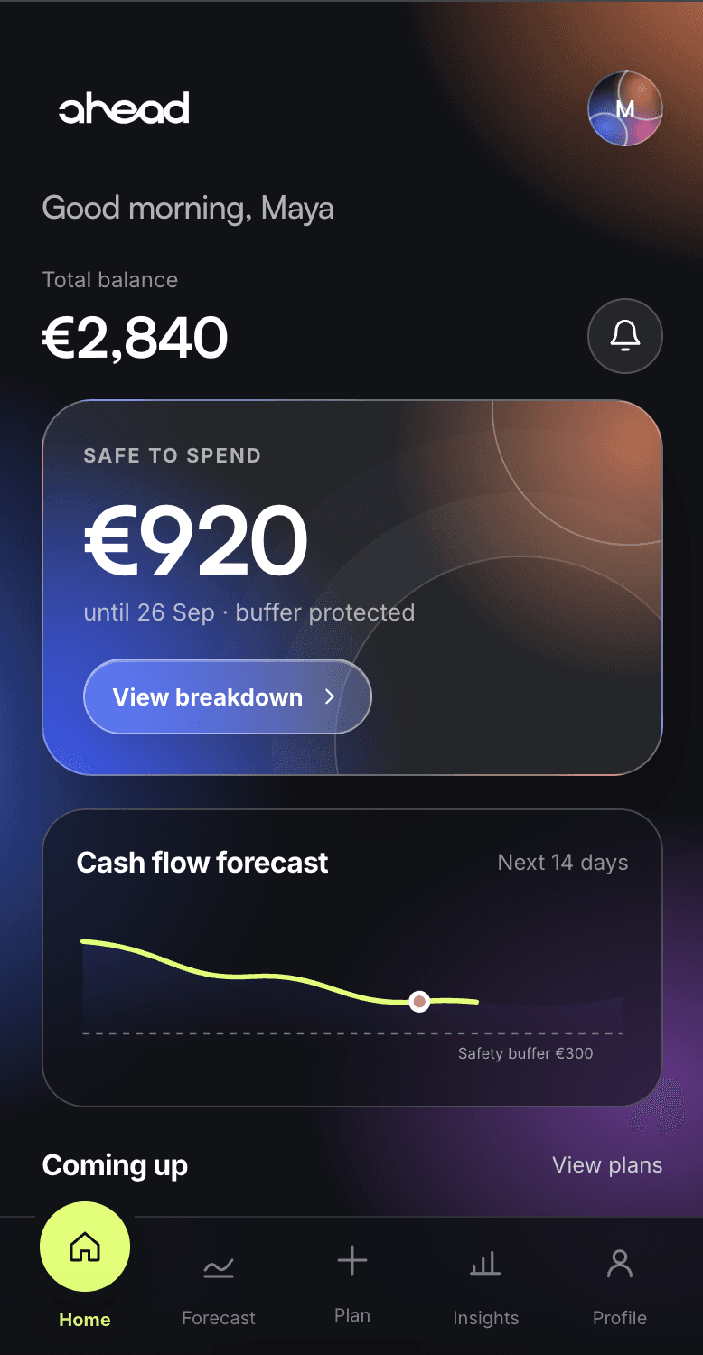


Every screen answers one thing first.
The interface avoids treating every financial metric as equally important. Hierarchy changes depending on the decision the user is currently making.
Safe to spend before account balance.
A raw balance can look reassuring even when upcoming costs make a purchase risky. Ahead surfaces the usable amount first.
DECISION FIRSTNow and later live side by side.
Rather than warning users against spending, the product shows how changing the purchase date changes the outcome.
CONTEXTColour communicates state, not decoration.
Acid yellow marks safe, active or recommended actions while gradients visualise changing financial conditions.
CLEAR STATEA forecast that feels like yours.
A small personal detail makes the financial environment feel less rigid without competing with the core information.
Make it yours.
Personalisation lives inside the product. Users can choose and update their avatar directly from profile settings without interrupting their financial flow.

What if the date changes?
The user can move a planned expense through time and compare the financial effect live. A safer alternative becomes visible rather than hidden inside a warning.
The value appears when the forecast reacts.
Amount, purchase date and scenario can be changed without moving any money. The interface reacts immediately so the user can test a decision before committing.
Change one thing. See the future react.
Adjust the amount → move the date → compare scenarios → choose the safer plan.
The structure stayed. The signal got sharper.
The early wireframe already prioritised the answer, forecast and upcoming commitments. The final interface keeps that hierarchy while strengthening state feedback.
Focus: hierarchy, information order and one clear next step.
Focus: stronger decision states, clearer financial context and a calmer visual rhythm.
What I would validate next.
Rather than inventing test results, these are the three questions I would take into the first usability round.
Do users understand “safe to spend” immediately?
Ask users to explain the number in their own words and identify what protects it.
Suggested task · Home / ForecastCan users compare now vs. after payday?
Give them a planned expense and observe whether the safer date is clear without prompting.
Suggested task · Plan playgroundDo users know this is only a simulation?
Confirm that testing a scenario never feels like money has already moved or a payment has been scheduled.
Suggested task · Scenario flowNavigation becomes a physical response.
The selected action expands, rises from the navigation bar and gives every tap a clear destination.
Purchase €600
One clear action after the comparison.
Less dashboard. More decision support.
The hardest part was deciding what not to show.
Ahead became stronger when financial data stopped competing for attention. The final system gives each moment one primary answer, then lets users inspect the reasoning when they need it.
Hierarchy is a product decision.
Reducing data can increase confidence when the remaining information maps directly to the user’s next action.
Test the forecast with real scenarios.
The next iteration would validate terminology, perceived trust and whether the safety buffer remains clear across different financial situations.